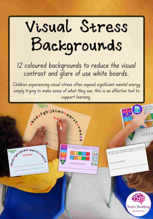
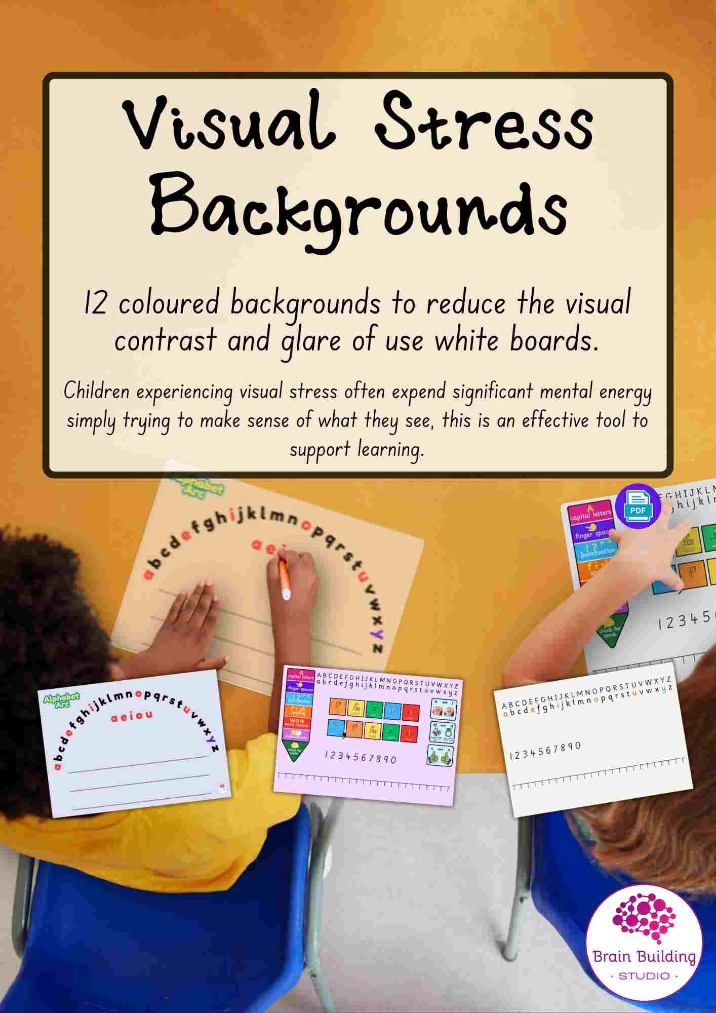
 Understanding Visual Stress and the Use of Coloured Backgrounds
What is Visual Stress?
Visual stress is a visual processing difficulty where the brain struggles to cope with certain visual information, particularly bright, high‑contrast, or glare‑heavy backgrounds, such as black pen on a white surface. In busy, brightly lit classrooms this can become overwhelming. Visual stress may also be known as Meares–Irlen Syndrome or pattern glare.
Visual stress is not a learning difficulty and does not reflect intelligence or effort.
How Visual Stress or Eye Strain Can Affect a Child
Physical effects may include:
- Headaches or eye pain during or after written work
- Eye strain, tired or sore eyes
- Squinting, rubbing eyes, excessive blinking
- Sensitivity to bright light or white surfaces
- Blurred, moving, or distorted text
- Fatigue during reading or writing tasks
Mental and emotional effects may include:
- Reduced concentration and attention span
- Avoidance of writing or reading
- Slower working speed
- Frustration, anxiety, or emotional overload
- Reduced confidence and engagement
Children experiencing visual stress often expend significant mental energy simply trying to make sense of what they see.
The Benefit of Using a Preferred Coloured Background
Using a coloured background can reduce glare, soften contrast, and stabilise visual input, making tasks more comfortable and accessible. Benefits can include:
- Improved visual comfort
- Better focus and stamina
- Increased willingness to engage in written tasks
- Improved handwriting control and accuracy
- Reduced anxiety linked to visual overload
There is no single correct colour. The most effective colour is the one the child finds most comfortable.
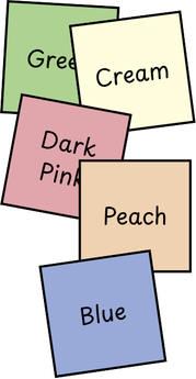 Examples of Effective Colours for Visual Stress
While individual responses vary, many children find the following colours helpful:
- Soft blues and blue‑greys – often calming and glare‑reducing
- Mint green or pale green – frequently reported as visually comfortable
- Light grey – reduces contrast without adding colour intensity
- Cream or soft beige – gentler than bright white
- Pale peach or pastel pink – helpful for some children
Bright colours (such as strong yellow or vivid white) are often less comfortable.
Children should always be encouraged to trial and choose the colour that feels easiest on their eyes.
Important Note on Dyslexia
Visual stress does not indicate dyslexia. Although visual stress and dyslexia can co‑occur, they are separate conditions. Many children with visual stress do not have dyslexia, and many children with dyslexia do not experience visual stress. Visual stress affects how text is seen, not how language is processed.
Using the Printed Sheets in a Dry‑Wipe Pouch
These sheets are designed for use inside a dry‑wipe pouch or pocket, offering a reusable alternative to whiteboards.
How to use:
- Select the coloured background preferred by the child.
- Insert the sheet into a dry‑wipe pouch with the chosen side facing forward.
- Write using a standard dry‑wipe pen.
- Wipe clean and reuse as required.
This provides the flexibility of a whiteboard without the harsh white background.
Additional Learning Supports Included
The set also includes:
- Alphabet Arc – supporting letter recognition, sequencing, and phonics
- Maths Timeline – supporting number sense and visual maths references
- Letter & Number Formation – printed on the reverse of the coloured sheets
- Colourfgul Semantics - support for sentence structure
These additions support both visual comfort and essential learning skills.
Download here Either laminate or use in wipeable pockets and mix teh activities up!